
The way people access the internet has changed dramatically. Today, over 70% of global web traffic comes from mobile devices. This shift has made responsive design and mobile-first experiences more important than ever. If your website is not optimized for smartphones and tablets, you’re not only losing visitors but also valuable business opportunities.
At Web Tech Digital Solution, we specialize in responsive website redesign services that transform outdated websites into modern, mobile-friendly platforms. Our redesign approach ensures your site looks stunning, loads fast, and performs seamlessly across all devices—desktop, laptop, tablet, and mobile.
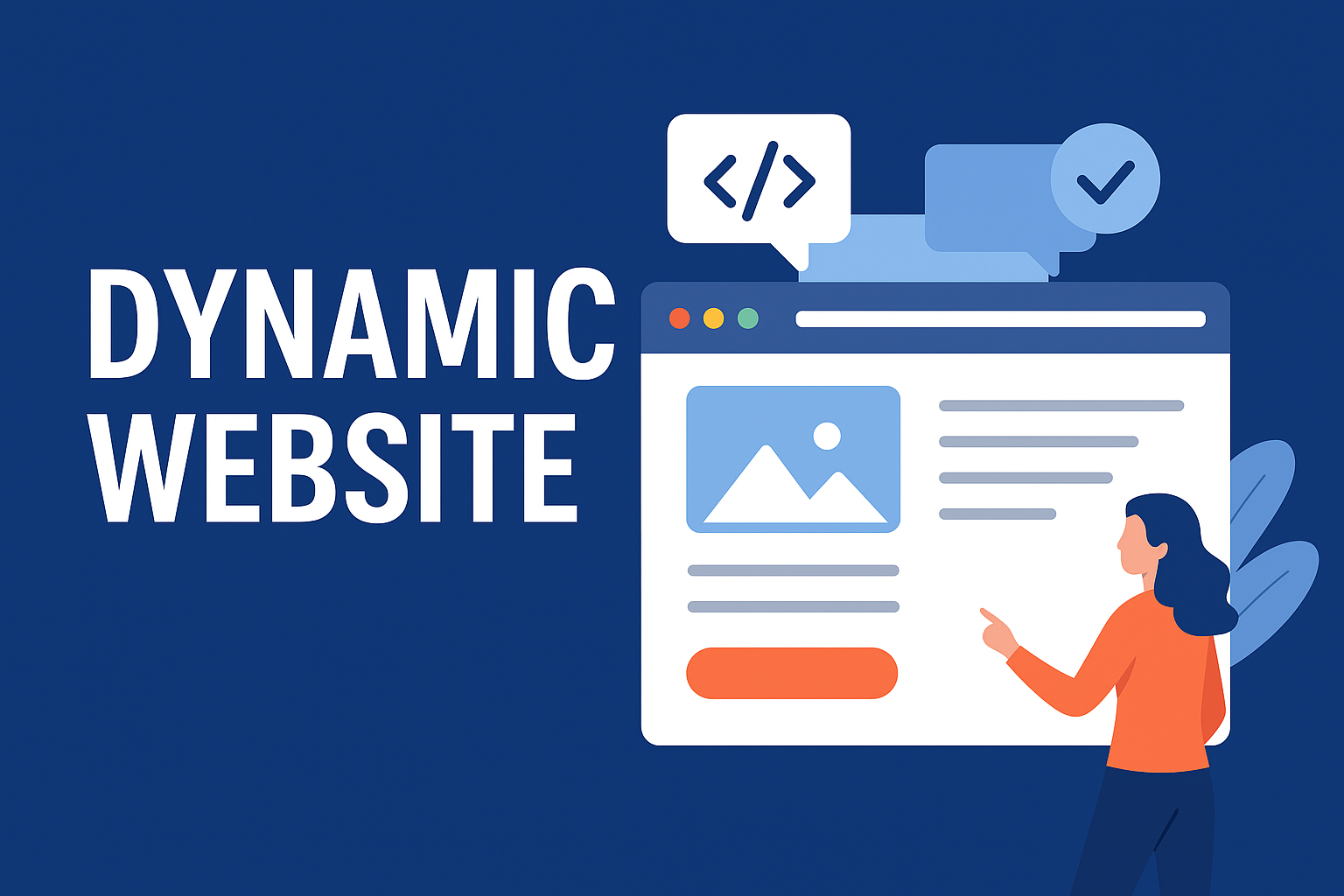
A responsive website redesign is the process of updating an existing website to ensure it automatically adjusts its layout and functionality based on the user’s device. Unlike older websites that are fixed in size, a responsive site delivers:
In short, it’s about future-proofing your digital presence for a mobile-first world.
At Web Tech Digital Solution, we go beyond cosmetic updates. Our responsive redesign services focus on usability, performance, and business impact. We blend creative design, mobile-first strategies, and advanced coding practices to deliver websites that meet the demands of today’s digital users. Whether you want to modernize your existing website, improve its SEO, or enhance customer engagement, we provide end-to-end redesign solutions that help your business grow.
When you choose Web Tech Digital Solution, you get more than a new look—you get a website optimized for mobile-first success. Here are the features we provide:
Your website may look functional, but it might be holding your business back. Here are signs it’s time for a redesign:
If any of these apply, a responsive redesign can transform your digital presence.

HTML

CSS

Bootstrap

JavaScript

jQuery

React
Node.js

Laravel

PHP
MySQLi
MongoDB

Java

Photoshop

Android

Flutter
WordPress

Shopify
Design as Services is way forward
ative website design that is modern, responsive, and u
